Thursday, June 4, 2009

In Context

Image of stool in context at one of the display stalls at 100% Design Tokyo
Background image sourced from: http://www.flickr.com/photos/mrwhojustin/3033529201/sizes/o/

Branding


Here are a number of ways I could brand my stool. I chose to use the 100% Design Tokyo Logo as this is where it theoretically would be place.
I looked at a number of ways of doing the branding:
  1. Could cut out the stencil from the cardboard leaving the corrugations exposed reveling the logo
  2. Could create a stencil and use spray paint to do it.
Here is an example of a stencil I created and stuck on my stool. It is just cut out from a print out and stuck on with blu-tack so it firstly doesn't damage the final stool and secondly can be moved around to see where it looks best. I believe that putting it on the back of the stool it probably the best place for it as passers by will see it more often people are sitting on them around a table.

Xanita Board 1:1 Final


HERE IT IS!!
After a few failed attempts this is my final model. I remade all the parts to make sure everything was going to fit together nicely. The top part of the design all slots into the base very tightly. The design may look simple but figuring out all the slots was a pain. The triangular sides were a pain to get right but i just did a little bit at a time and now it fits together nicely and nothing pops out under pressure. The triangular sides also provide direction as they slop towards the front of the stool.

Strength wise i don't think its going to be a problem. I don't think it will actually come apart ever again its fitted so tight.
Overall I am very happy with the outcome.


Here is a video of the chair assembly process:

Sunday, May 31, 2009

Xanita Board 1:1 Attempt 2


This is the second Xanita model I made. Using the already existing base from the previous model I modified the top part to make it fit nicely onto the base (see below). The two front panels slotting in perfectly flush and the back slotted in nicely as well. I found working out where to slot the two side triangles difficult but in the end got it pretty close. The only major problem I found with this was that I cut the side slots too big which allowed the side panels to slip in and out too easily.

This design easily holds my weight, in fact I had two people standing on it the other night so I have to say its pretty solid in terms of support.

Xanita Board 1:1 Trail Model


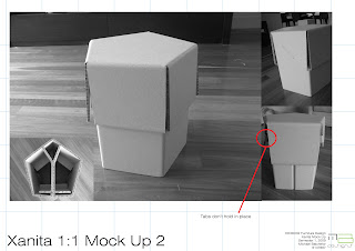
This is the first 1:1 model I made using Xanita Board. I found that the base worked really well and came together nicely but when I tried to add the top part on it was too small so didn't fit properly. The pentagon shape was too short thus making it hard ford everything else to fit. the front pieces that did slot in were not flush up against each other either. The images above show the slotting problems.

Saturday, May 30, 2009

Flat Pack


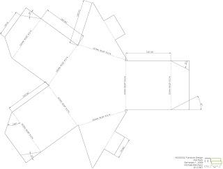
If you imagine this is the correct sized board of Xanita (1800 x 1200) then this is how the flat pack could look if this chair was being massed produced.
The base would fit up the top. (BTW it would actually be longer when taking bends into consideration but it still fits)
Two top parts could be made on one sheet and at least four braces could easily fit.
I added in the second top part as it shows how much space would actually be left over.

Xanita Board 1:2 Base Trial


This is a quick 1:2 Mock up of the base for my design. I did it purely to figure out the exact amount of Xanita I would need to cut away to allow it to bend correctly and sit flush together.

The answer:
  • 13mm for the 72 degree angles and;
  • 16mm for the 90 degree angles
I also added a brace into base to hold it flush together. (see Top Right photo). Will need to add another brace to the other side on the 1:1 model.

Wednesday, May 27, 2009

Cardboard 1:1 Mock Up


Quick Mock up 1:1 model of my chair/stool design. Using multiple sheets of cardboard stuck together to get the correct thickness is just a pain in the ass to put it plainly. I found that it was still flimsy and didn't give a good indication whether or not this idea would work. What was good about this though was to get a sense of scale and proportion. It also did support me when sitting gently on it.

Things is need to figure out still:
  • correct dimensions
  • how much card to cut away to get correct angles when bending
  • bracing
  • the exact spots when the top part can slot into the base
Most importantly however is not to slice my finger off like some people have in the last few weeks!!

Tuesday, May 26, 2009

Final Design Scaled Model 1:4

FINALLY!!! I have come up with this design for my final piece. It is a very simple and clean shape because i cannot understand why people would want to make it hard on themselves by making something more complicated. This design is a basic pentagon frame and a top part that locks into the frame.
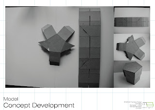
This is the flat pack of the model. I have worked out that i would be able to make the base and two (2) of the top pieces from the xanita sheet.

Now i need to figure out the exact lengths of each piece when folding is taken into consideration.
I will also consider adding extra braces into the base as it will add extra support and stability when the user sits on it.

Wednesday, May 13, 2009

Model Concept


This is a development on the previous idea. I added side wings to the top part as I think this will add extra support to the overall design.
One problem i have now found with this design is that the base is flimsy and wobbles around. therefore the base can either be modified or a new design must be found.

Monday, May 11, 2009

Model Concept


This model just happened to come about by mucking around with scrap pieces of card. It started with two pieces slotted into each other and then the top part was randomly added. The outcome was surprising with every angle of the design being interesting when looked at. There are a couple of design floors that need to be addressed, such as the corners are not overly stable but this can be easily fixed by extending the base cross pieces. I will also look into adding a back rest. Overall i think it will easily support 100kg and with the allocated material allowance I should be able to produce two (2) of these which should be helpful.

I intend on pursuing this idea into a final concept.

Model Concept

Tuesday, May 5, 2009

Personal Brief

I have chosen to design my chair/stool for the 100% Design Tokyo festival. I have chosen two areas which I think will be appropriate placement options for my chair/stool. These two areas are:
Either Side of the bar
or;
The exterior cafe and surrounding grounds.
(Please see above diagram)

My chair will be a simple design. i will look into two different methods of constructing my chair this being slotting multiple pieces together and folding a chair from a flat-pack design.
Requirements of the chair include:
  • Ease of construction;
  • Simplicity;
  • Easily transported and moved around; and
  • Above all the chair need to be sturdy and comfortable to sit on

Wednesday, April 22, 2009

Initial Concept 3


This design is all kinds of awesome! Very simple as it is two exactly the same pieces slotted together. I would really like to pursue this idea however after speaking to the workshop guys they believe it would be too flimsy as too much material is cut away in order for the 2 pieces to slot together. Also angular cuts would need to be made which would be an absolute pain. will try and work around this however!

Initial Concept 2